KitchenAid / Consumer Goods
KitchenAid In Color
Consumer GoodsCGI AnimationMotion Typography
KitchenAid / Consumer Goods
Overview
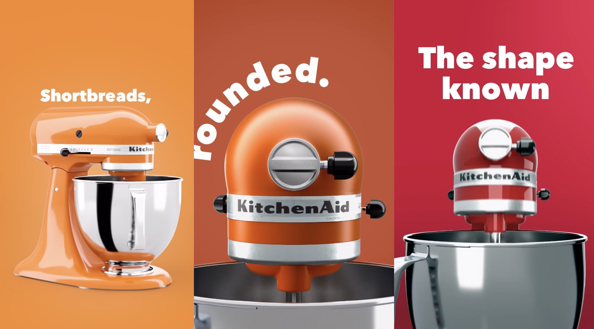
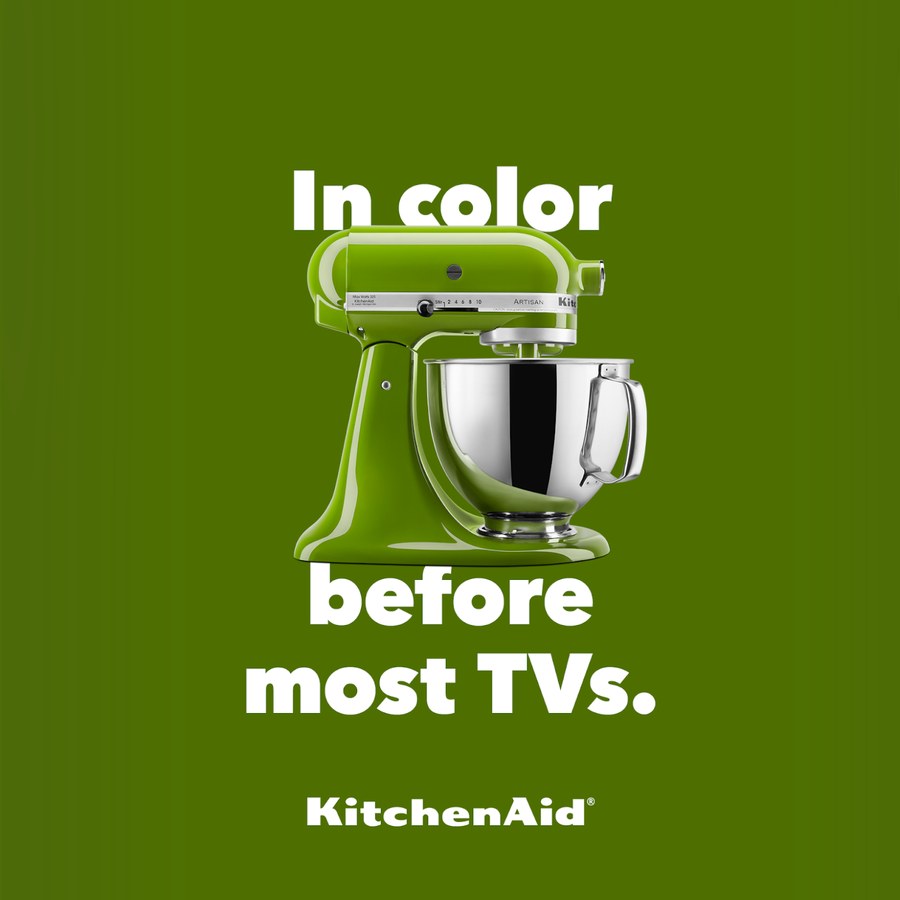
KitchenAid asked for a campaign around a piece of design that has not changed shape in a century. The answer was to let the type and the object hold each other up: the words trace the contours of the mixer, and the mixer gives the words their structure and momentum. Nothing else enters frame. The films are CGI, one colourway each, the background matched to the machine, and they are cut square and vertical for the feed rather than the break.
The films
Nine films across the range. The squares run wide on the colour story, the verticals take one shade each and name it after what you would make in it.
The idea
The treatment set up a third element that is never actually pictured: the food. By twisting, turning, melting and jiggling the words, the type evokes what the mixer is for without ever showing a dish. The lines lean on the machine's silhouette and let the joke land on the shape itself.
Line
The shape known for tilting heads.
Line
Well known for being well rounded.
Line
We let our beauty go right to our bullet-shaped head.
Line
Pizza, penne and panna cotta all have one shape in common.
Line
Shortbreads, flatbreads and long breads all have one shape in common.
Style frames
From the development decks, and two of the finished films are in them almost shot for shot. TV in Colors opens on a grey machine and bands the colourways in behind it before landing on the line. The orange boards became The 70s. What the frames are for is the argument underneath the campaign: this shape was sold in colour before most living rooms had it.
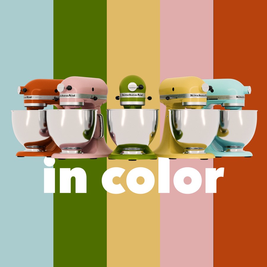
The range on its colour bands
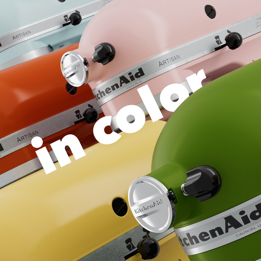
Mixers in motion
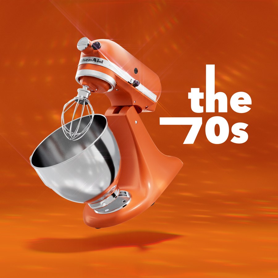
Made it through the 70s
End card
The sound
The reference was Johnnyrandom's Bespoken, a track built entirely from sounds generated by bicycles. The same approach was taken here, and Paulo Beto at Anvil FX built the score with a stand mixer, a handheld recorder and a violin bow: the motor close-miked at each speed, the whisk and the bowl played as instruments. Nothing else was used. Three options were cut and tested before the campaign was scored.
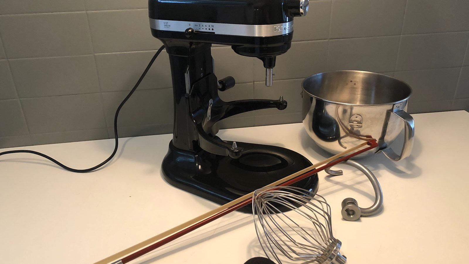
The session, laid out
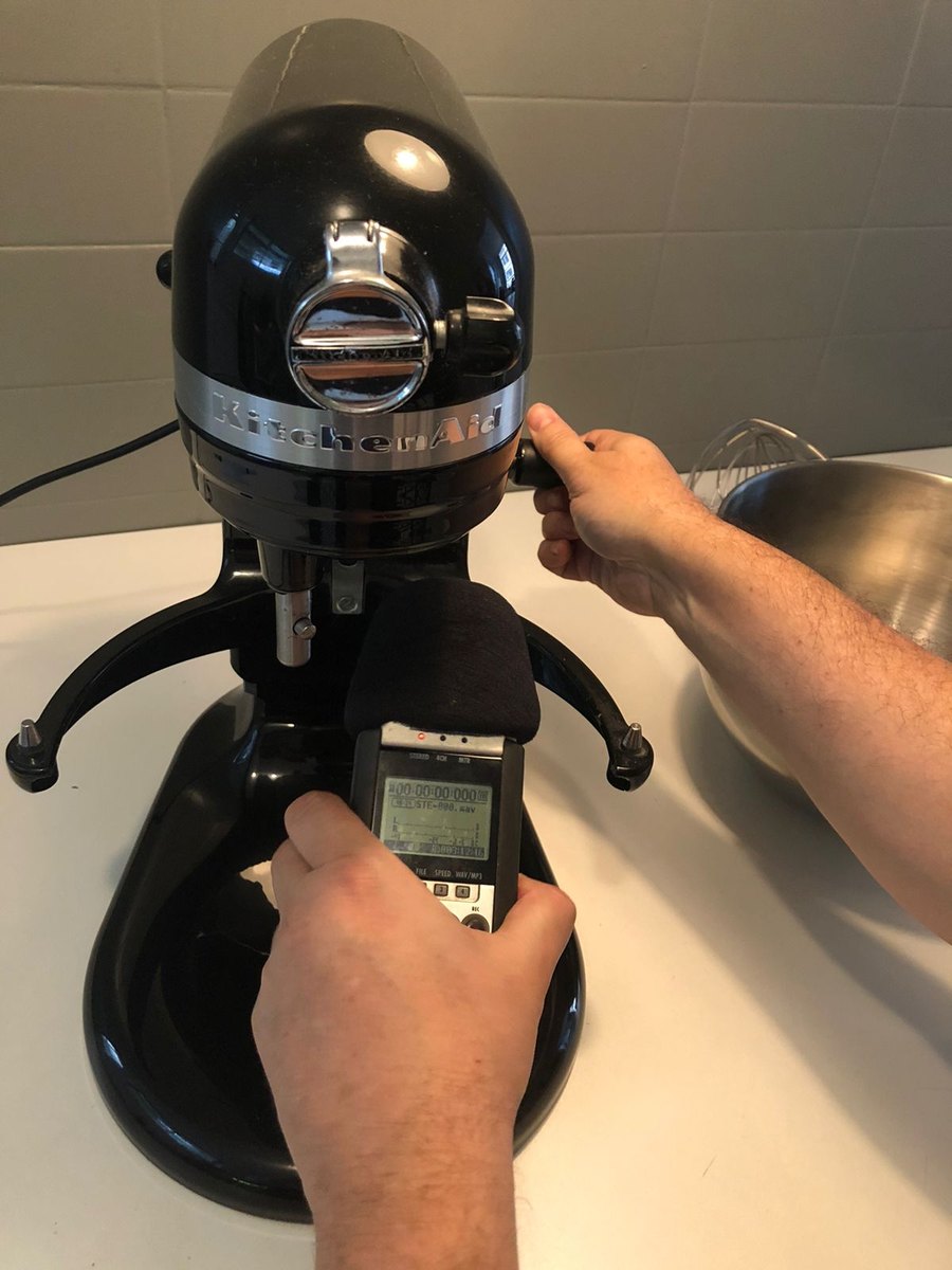
Close-miking the motor
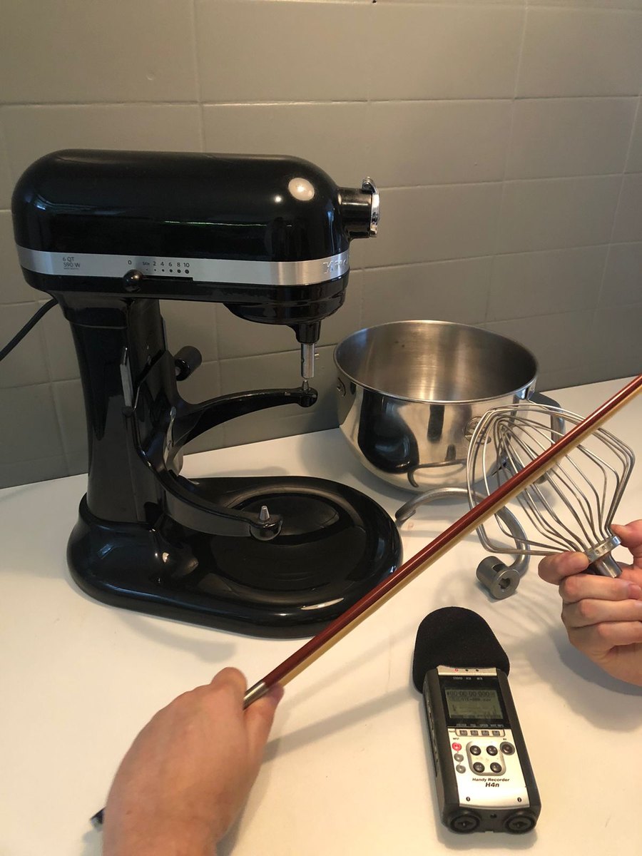
A bow across the whisk
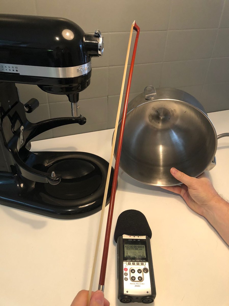
Bowing the bowl
Credits
Client
KitchenAid
Directors
Mateus de Paula Santos
Felipe Frazão
Executive Producer
Luis Ribeiro
Client Management
Rafael Passos
Head of Production
Clara Morelli
Post Production Coordinator
Rosangela Gomes
Post Production Assistant Coordinator
Bruna Boretto
Post-Production Producer
Larissa Zazula
Cassiana Umetsu
Render
Daniel Tres D
Marcos Rigobello
Murilo Lopes
Vinicius Lavor
Motion Design & Composition
Daniel Tres D
Marcos Rigobello
Murilo Lopes
Vinicius Lavor
Sound Design and Mix
Paulo Beto
Anvil FX Music and Sound Design
Production company
LOBO
More work